
Reading Time: 6 minutes
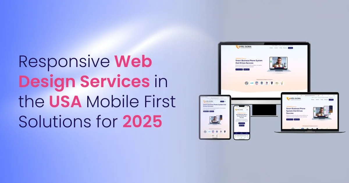
Table of Contents
Introduction to Mobile First Design
In the United States, over half of website traffic comes from mobile devices. If your website is not built with a mobile-first approach, you are losing potential customers before they even see your services.
Our responsive web design services focus on mobile-first architecture that improves user experience, search rankings, and lead conversions. A non-responsive site increases bounce rates, lowers trust, and directly impacts revenue.
Development Services for Responsive Websites
We design and build responsive websites that work well on all devices. We use flexible images, media queries, and fluid grids. This makes sites that look good and load fast. Fast sites also help SEO. Responsive design keeps your brand the same on every device. This builds user trust and helps SEO.
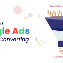
Our process makes it easy to maintain your site by removing the need for many versions. Our web designers and developers follow a clear design and development process. This ensures websites are high quality and easy to use. More importantly, it ensures your website converts visitors into inquiries. A responsive structure improves form submissions, reduces abandonment, and increases engagement across devices. This approach delivers a smooth experience across every screen size.
The Benefits of a Mobile-First Approach
A mobile-first approach has many benefits. It puts small screens first. This gives mobile users a fast and easy experience. Navigation is simple and important content is easy to find. This approach then grows naturally to bigger screens. It keeps the look and feel the same.
Focusing on mobile users also boosts satisfaction. It matches search engines’ mobile-first indexing. In competitive US markets, businesses with faster mobile experiences consistently outperform slower competitors in both rankings and conversions. This helps SEO and brings more organic traffic. In the end, a mobile-first plan keeps your website ready for future changes. It helps your site keep up with new digital trends and user habits.
Key Features of Great Responsive Websites
1. Flexible Layouts and Fluid Grids
These help the website fit different screen sizes smoothly. The site keeps its shape and looks good.
2. Flexible Images
Images change size to fit devices. They stay clear and load fast without distortion.
3. CSS Media Queries
These add styles based on device type. They improve usability and look on different screens.
4. Fast Loading Times
We optimize content and code for speed. Fast loading keeps users and helps SEO.
5. Consistent Brand Identity
Your brand looks the same on all devices. This builds trust and recognition.
6. Intuitive Navigation Designs
Menus and controls are easy to use on touch and click devices.
7. User-Centric Design
We focus on what users need and like. We use tools like heatmaps to improve user journeys. User-centric design maps user paths and uses heatmaps to improve site interaction. This helps the design meet user needs and boosts satisfaction.
8. Accessibility Features
We make sites usable for people with different abilities. This ensures everyone can use your site.
9. Scalability and Future-Proofing
We build with tools that allow easy updates. This helps your site adapt to new devices and features.
These features make sure responsive websites look great. They also give smooth, engaging, and useful experiences. This leads to happy users and business growth. These features are not just technical enhancements. They are conversion drivers that reduce bounce rates, increase time on site, and improve lead quality.

Ecommerce Website Design Solutions
Our ecommerce website design fits the needs of online stores. We use top tools like React, Angular, and Vue.js. These help make responsive ecommerce sites that boost sales and mobile shopping. Our expert web designers use user-centric design. They use heatmaps to improve user actions. This creates a smooth shopping experience on all devices. Our responsive ecommerce designs give steady and fun experiences. This improves mobile checkout completion rates, reduces cart abandonment, and increases overall ecommerce revenue.
Custom Solutions for Businesses
We offer custom responsive web design made for your business. Every visitor gets a unique and engaging experience. Our expert designers and developers work closely with clients. A dedicated project manager keeps communication clear and updates on time. Working together leads to plans that improve user experience and brand strength. Our US-based project teams ensure timelines are met, communication remains clear, and performance goals align with measurable business outcomes.
We use the latest tools and trends to make sites that look good. They beat expectations, raise user engagement, and bring more organic traffic. This gives your brand a strong edge. Custom responsive design not only meets but beats expectations. It makes your website stand out in a busy digital world.
Google’s Mobile First Indexing and SEO
Our responsive web design services work well with Google’s mobile-first indexing. This helps your site rank higher on search engines. We use one URL for all devices. We also use CSS media queries and other tools. This makes sites mobile-friendly and smooth to use. Our expert team follows top industry practices. They focus on mobile-friendliness and speed. This helps SEO and brings more organic traffic. Because Google uses mobile-first indexing, your mobile version is now the primary version evaluated for ranking. A weak mobile structure directly impacts your search visibility.
Creating a Seamless Digital Experience
Today’s digital world changes fast. A seamless digital experience helps your business stand out. Responsive web design services make your site fit all devices and screen sizes. This gives the best user experience and keeps visitors interested.
Expert designers use HTML, CSS, JavaScript, and frameworks like React, Angular, and Vue.js. They build flexible ecommerce sites that show your brand well. They also boost customer happiness. Whether you launch a new site or upgrade your current one, responsive web design helps growth. It raises engagement and keeps your online presence ready for the future. If your current website struggles with mobile performance, now is the time to modernize your digital foundation before competitors gain the advantage.
Build a Mobile-First Website That Converts
Let our responsive web design team create a fast, scalable, and conversion-focused website tailored to your goals.
Frequently Asked Questions (FAQs)
1. What are responsive web design services?
Responsive web design services make websites that fit all screen sizes and devices. These include desktops, tablets, and mobile devices. This gives a steady and good user experience no matter how visitors see your site.
2. Why is a mobile-first approach important in responsive web design?
A mobile-first approach puts small screens first. This makes sure mobile users get the best experience. Then, the design grows well for bigger screens. This plan improves usability on mobiles and raises user satisfaction and engagement.
3. How does responsive design enhance SEO?
Responsive design helps SEO by using one URL and the same content on all devices. This makes it easy for search engines to index your site. Studying competitors helps make better responsive design plans. Responsive sites also load fast and give good user experiences. This cuts bounce rates and raises search rankings, especially with Google’s mobile-first indexing.
4. What technologies are used in responsive web design?
Responsive web design uses flexible layouts with fluid grids, flexible images, and CSS media queries. New development also uses tools like HTML5, CSS3, JavaScript, React, Angular, and Vue.js. These help build scalable and flexible websites.
5. Can responsive web design services help improve mobile conversions?
Yes. Responsive web design services give a smooth and easy experience on mobile devices. This can raise mobile conversions a lot. A well-made responsive site guides users well. It helps them find what they want and take action. This lowers cart abandonment and grows sales.
6. How long does it take to develop a responsive website?
The time depends on how big and complex the site is. Simple sites take a few weeks. Larger or custom sites may take weeks or months. Working with a responsive web design agency with a proven track record helps finish on time.
7. Why should I choose a responsive web design agency in the USA?
A USA agency has expert responsive web designers who know the local market and audience. They give dedicated project managers and follow top industry practices. They deliver cost-effective and future-proof solutions that boost user experience.
8. What is the difference between responsive and adaptive web design?
Responsive design uses flexible layouts that fit any screen size. Adaptive design uses fixed layouts made for certain devices. Custom responsive design keeps your site looking the same on all platforms. Responsive design makes it easier to maintain one site. It also keeps things consistent on all devices.
9. How does responsive design make website management more cost-effective?
Responsive design removes the need to keep separate sites for desktop and mobile. This cuts development and maintenance costs. Updates and new features apply to all devices with one responsive site.
10. How can responsive web design services future-proof my website?
Responsive web design services build sites with flexible layouts and scalable tools. These adapt to new devices and screen sizes as they come. This keeps your site working well and looking good in the changing digital world.
Published: November 3rd, 2025