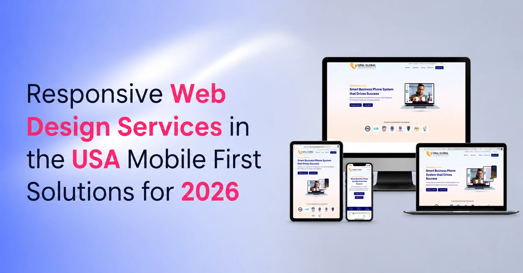
Responsive Web Design Services in the USA: Mobile-First Websites That Convert
Your website may look good on a desktop, but that does not mean it works well for today’s users. Customers switch between phones, tablets, laptops, and larger screens before they decide to call, buy, book, or submit a form. If your website feels slow, crowded, or difficult to use on mobile, users often leave before they understand your offer.
That is why businesses need Responsive Web Design Services in the USA built around mobile-first usability, fast loading, clean navigation, and conversion-focused layouts. In April 2026, mobile devices represented 44.61% of U.S. web traffic and 52.8% of global web traffic, making responsive design essential for both local and broader digital visibility.
A responsive website helps your brand deliver one consistent experience across devices. It supports better SEO, stronger engagement, easier website management, and smoother customer journeys from the first visit to the final action.
Table of Contents
What Are Responsive Web Design Services?
Responsive web design services create websites that automatically adjust to different screen sizes, devices, and browsers. They use flexible layouts, responsive images, CSS media queries, and mobile-first design practices to make every page easy to read, navigate, and use on phones, tablets, laptops, and desktops.
Google also recommends responsive design because it serves the same HTML on the same URL while adapting the display based on screen size, making it easier to implement and maintain.
Why Does Mobile-First Responsive Design Matter?
Mobile-first responsive design matters because users do not wait for poor experiences to improve. If a page loads slowly, buttons are hard to tap, forms feel too long, or content is hidden behind cluttered layouts, visitors move on.
A mobile-first approach starts with the smallest screen first. This forces the website to focus on what matters most: clear messaging, simple navigation, fast access to key pages, visible calls to action, and smooth form completion.
For businesses, that means:
- Better first impressions on mobile devices
- Lower friction during browsing and form submission
- Cleaner user journeys across all screen sizes
- Stronger SEO alignment with Google’s mobile-first indexing
- Better conversion potential from paid, organic, and referral traffic
Responsive design is not only about making a website “fit” the screen. It is about making every screen easier to use.
What Do Top Responsive Web Design Services in the USA Do Differently?
Top responsive web design services do more than resize layouts. They plan the website around user behavior, business goals, SEO structure, and conversion paths.
They focus on:
Mobile-first page structure: Important content, calls to action, contact options, service details, and trust signals appear early and clearly.
Flexible design systems: Layouts use fluid grids, scalable spacing, and reusable components so pages stay consistent across devices.
Performance-focused development: Images, scripts, code, and page elements are optimized to improve loading speed and reduce user drop-off.
SEO-friendly architecture: One URL structure, clean internal linking, crawlable content, and mobile-friendly layouts help search engines understand the site.
Conversion-ready UX: Forms, buttons, menus, product cards, and service sections are designed for easy interaction on touchscreens and desktops.
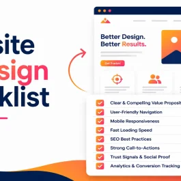
Key Features of a High-Performing Responsive Website
A strong responsive website combines design, development, SEO, and usability. The goal is to create a website that feels natural on every device instead of forcing users to zoom, scroll awkwardly, or search for basic information.
1. Flexible Layouts and Fluid Grids
Flexible layouts allow page sections to expand, shrink, stack, or rearrange based on screen size. This helps the website maintain readability and visual balance across phones, tablets, laptops, and widescreen monitors.
2. Responsive Images and Media
Images, videos, and graphics should scale without distortion or slow loading. Techniques like responsive images, srcset, and the <picture> element help browsers serve better image versions for different devices and resolutions.
3. CSS Media Queries
Media queries apply different styles based on screen width, resolution, orientation, or device characteristics. They help developers create layouts that shift smoothly from single-column mobile views to larger desktop layouts.
4. Fast Loading Times
Speed directly affects user patience. A responsive website should reduce unnecessary scripts, compress images, use clean code, and avoid heavy layouts that slow down mobile users.
5. Consistent Brand Identity
Your colors, typography, visual style, messaging, and calls to action should feel consistent across all screens. This builds trust and makes your business easier to recognize.
6. Simple Navigation
Responsive navigation should be easy to tap, scan, and understand. Menus, dropdowns, search bars, and buttons must work smoothly on both touch and click devices.
7. User-Centric Design
Responsive design should reflect how users actually move through the website. Heatmaps, analytics, scroll tracking, and behavior insights help improve page layouts, button placement, and conversion paths.
8. Accessibility Support
A responsive website should be usable for people with different abilities. Clear contrast, readable text, keyboard-friendly navigation, alt text, and accessible forms create a better experience for all users.
9. Scalable Website Structure
A responsive website should support future updates, new landing pages, ecommerce growth, blog expansion, and new device sizes without requiring a full redesign.
How Does Max-Width Improve Responsive Web Design?
The max-width property helps prevent content from stretching too wide on large screens while still allowing it to shrink on smaller devices. It keeps images, text blocks, containers, and sections visually balanced.
For example:
max-width: 100%;
height: auto;
This is often used for responsive images so they scale within their parent container without becoming distorted. For content sections, max-width helps keep text readable by preventing long lines that are difficult to scan.
When paired with relative units, fluid grids, and media queries, max-width gives designers more control over how pages behave across different screen sizes.
How Do Responsive Website Development Services Support Ecommerce?
Responsive ecommerce web design is critical because shoppers often browse on mobile and complete purchases across different devices. If product pages, carts, filters, or checkout forms do not work smoothly on mobile, sales can drop quickly.
A responsive ecommerce website should include:
- Easy product browsing on mobile screens
- Fast-loading product images and galleries
- Clear pricing, offers, and product details
- Simple cart and checkout flow
- Mobile-friendly payment options
- Trust signals near purchase decisions
- Search and filter options designed for touchscreens
For ecommerce brands, responsive design helps reduce friction from product discovery to checkout. It also supports SEO by creating cleaner product pages, category pages, and internal linking paths.
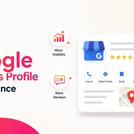
How Does Responsive Design Improve SEO?
Responsive design improves SEO by giving users and search engines a cleaner, more consistent website experience. Google’s mobile-first indexing means Google primarily uses the mobile version of content for indexing and ranking, so your mobile experience must be complete, crawlable, and easy to use.
Responsive design supports SEO through:
One URL for each page: This avoids separate mobile URLs and keeps ranking signals consolidated.
Consistent content across devices: Users and search engines can access the same core content on mobile and desktop.
Better usability: Clear layouts, readable text, and accessible navigation improve engagement.
Cleaner technical structure: Responsive websites are easier to maintain than separate desktop and mobile versions.
Improved content discovery: Search engines can crawl and understand pages more efficiently when the structure is consistent.
A responsive website does not guarantee rankings by itself, but it removes major usability and technical issues that can limit SEO performance.
What Common Responsive Design Mistakes Should Businesses Avoid?
Many websites fail on mobile because they are designed for desktop first and then squeezed into smaller screens. That approach often creates clutter, slow loading, and confusing user journeys.
Avoid these common mistakes:
Burying important content: Contact details, service value, pricing cues, and CTAs should not be hidden deep inside the page.
Using oversized images: Heavy visuals can slow down mobile pages and hurt engagement.
Ignoring real-device testing: Desktop previews do not always show real mobile problems. Test on actual phones and tablets.
Creating hard-to-tap buttons: Buttons and forms should be large enough for comfortable mobile use.
Using too much text above the fold: Mobile users need quick clarity before they continue scrolling.
Forgetting accessibility: Low contrast, tiny fonts, missing alt text, and poor form labels reduce usability.
Overloading pages with scripts: Too many plugins, tracking scripts, animations, and widgets can damage speed.
How Should Businesses Choose a Responsive Web Design Agency in the USA?
Choose a responsive web design agency that understands design, SEO, development, conversion strategy, and long-term website growth. A good agency should not only make the site look modern. It should help the website load faster, rank better, communicate clearly, and convert visitors into leads or customers.
Before hiring an agency, review:
- Their responsive design portfolio
- Their mobile-first development process
- Their SEO and technical website knowledge
- Their experience with your industry
- Their approach to speed and performance
- Their communication and project management process
- Their ability to support future updates
The right partner will design around your business goals, not just visual trends.
Build a Mobile-First Website That Converts
Let our responsive web design team create a fast, scalable, and conversion-focused website tailored to your goals.
FAQs
1. What are responsive web design services?
Responsive web design services create websites that automatically adjust to different screen sizes and devices. They use flexible layouts, responsive images, CSS media queries, and mobile-first development practices to make websites easier to use on mobile, tablet, and desktop screens.
2. Why is mobile-first design important?
Mobile-first design is important because many users visit websites from phones before using any other device. It helps businesses create faster, clearer, and easier experiences for mobile users while still supporting larger desktop layouts.
3. How does responsive design help SEO?
Responsive design helps SEO by using one URL, consistent content, mobile-friendly layouts, and easier website maintenance. Since Google uses mobile-first indexing, a complete and usable mobile version is important for search visibility.
4. What technologies are used in responsive website development?
Responsive website development commonly uses HTML, CSS, JavaScript, CSS media queries, flexible grids, responsive images, and frameworks such as React, Angular, or Vue.js depending on the project’s needs.
5. Can responsive design improve website conversions?
Yes. Responsive design can improve conversions by making pages easier to read, navigate, and act on across devices. Clear CTAs, faster loading, mobile-friendly forms, and smoother layouts help users complete actions with less friction.
6. How long does it take to build a responsive website?
A simple responsive website may take a few weeks, while larger business websites, ecommerce stores, or custom platforms can take longer. Timeline depends on page count, design complexity, integrations, content, and testing needs.
7. What is the difference between responsive and adaptive design?
Responsive design uses flexible layouts that adjust fluidly to different screen sizes. Adaptive design uses fixed layouts created for specific device sizes. Responsive design is usually easier to maintain because one layout system serves many devices.
8. Why should I hire a responsive web design agency in the USA?
A responsive web design agency in the USA can help businesses create websites aligned with local market expectations, user behavior, SEO standards, and conversion goals. The right agency brings design, development, and digital strategy together.
Published: November 3rd, 2025